Shop, Save: Apply Summer Codes and Save Up to 800 SEK*
Shop, Save: Apply Summer Codes and Save Up to 800 SEK*
Shop, Save: Apply Summer Codes and Save Up to 800 SEK*
Shop, Save: Apply Summer Codes and Save Up to 800 SEK*
Shop, Save: Apply Summer Codes and Save Up to 800 SEK*
Shop, Save: Apply Summer Codes and Save Up to 800 SEK*
Shop, Save: Apply Summer Codes and Save Up to 800 SEK*
Shop, Save: Apply Summer Codes and Save Up to 800 SEK*
Feb 15, 2019
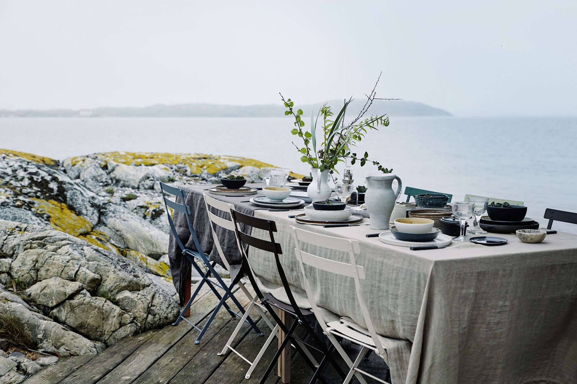
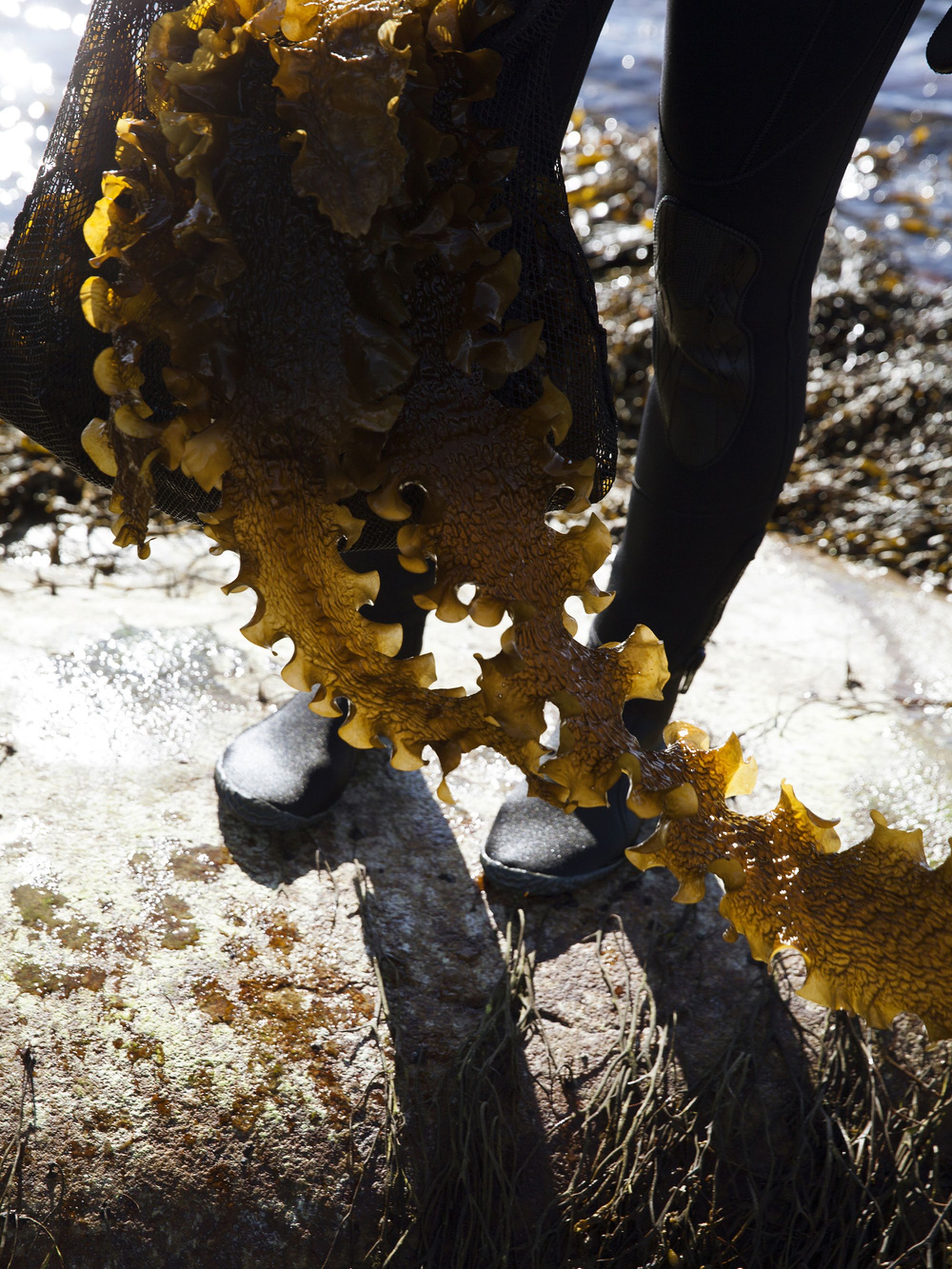
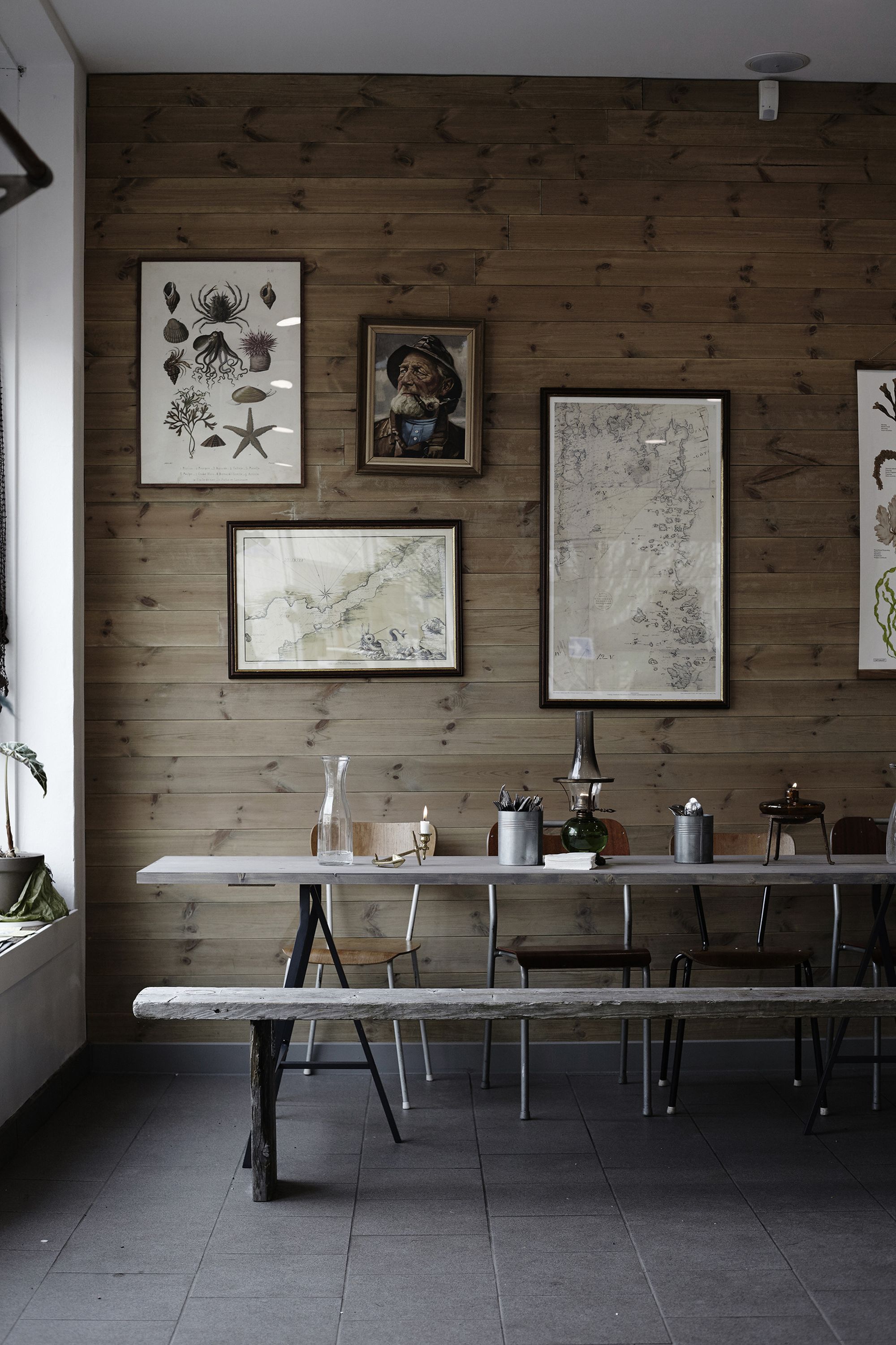
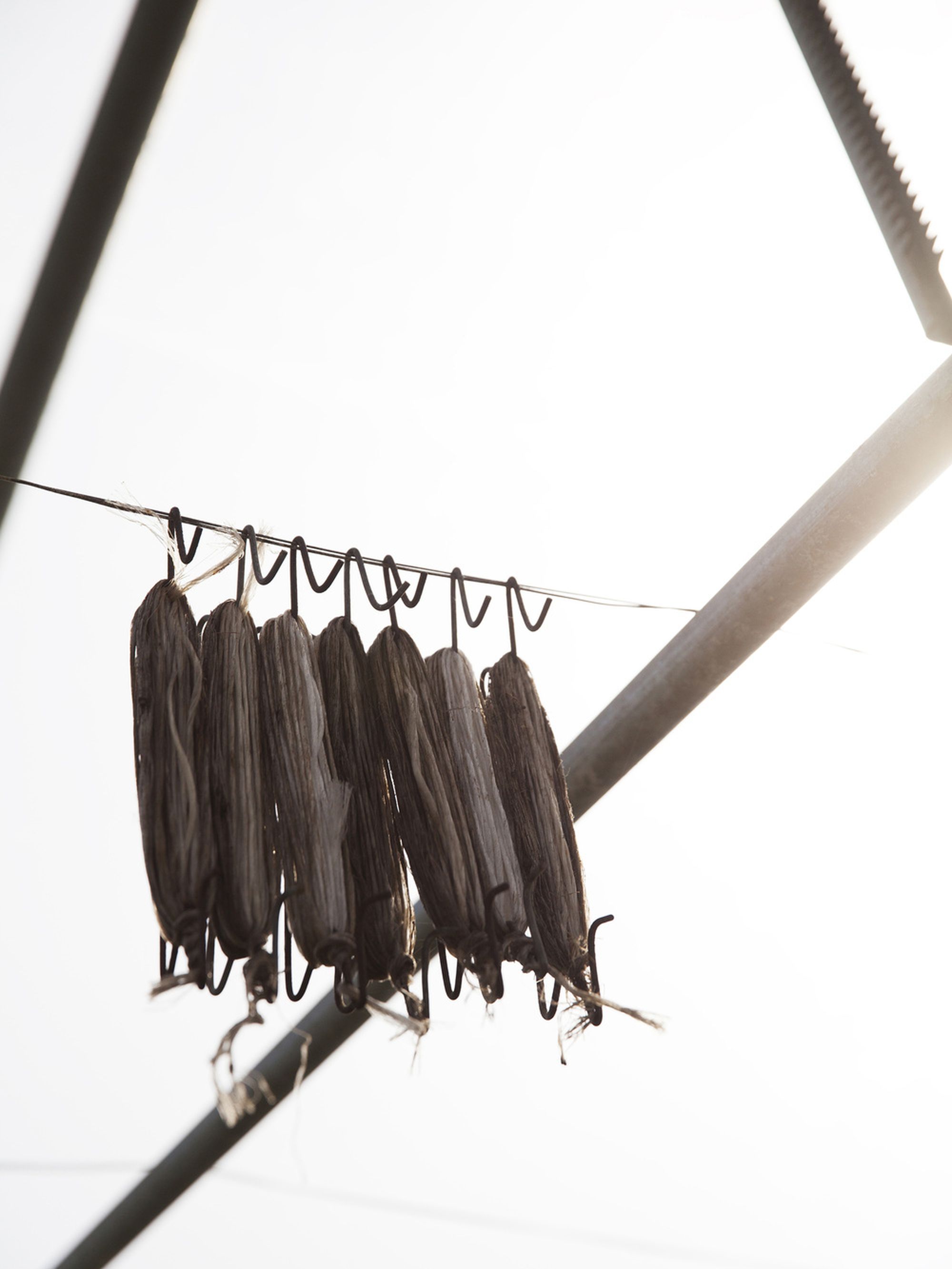
The Making of A. Journal of West Coast Culinary
“Beautiful, high-quality lifestyle cook book that garnish its site both in the bookshelf and on the kitchen counter. A stylish box in the same color shade as front and back cover. Photographs with a beautiful tone enhanced by the paper selection. Inspiring and appetizing with a fine sense of material.” – Swedish Royal Library
The alluring motivation above comes from the
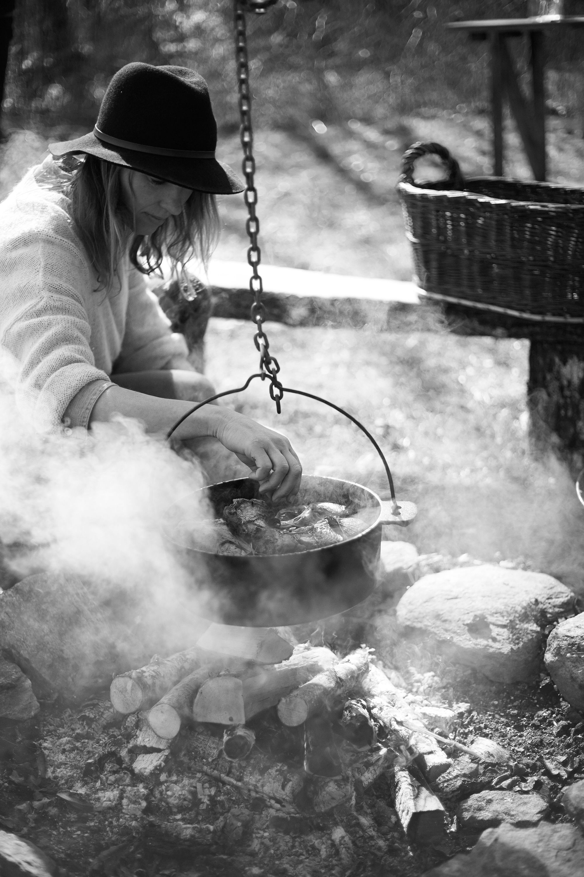
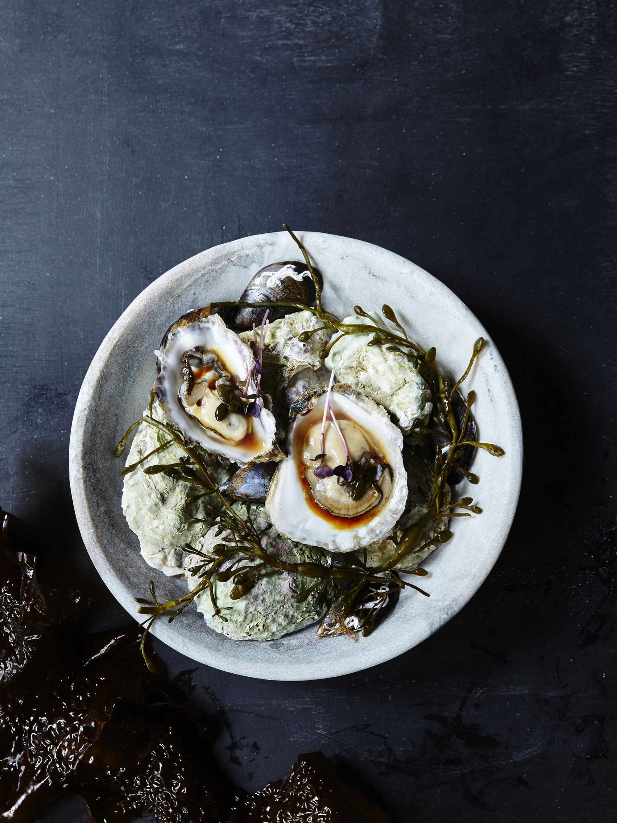
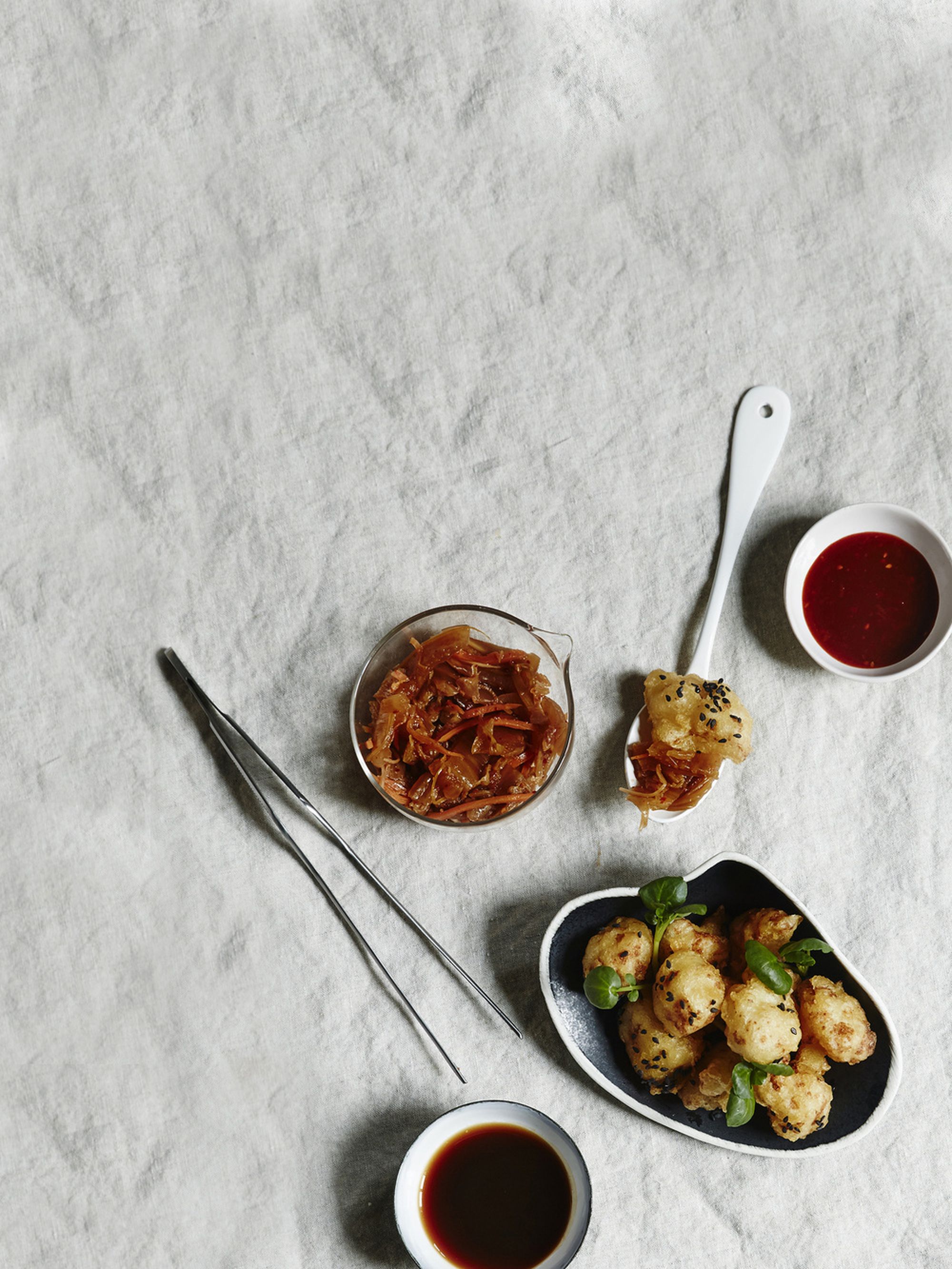
Swedish Royal Library where our very first book - A.Journal Of West Coast Culinary - just won the prestigious Swedish book art prize. With this book, our tribute to life in the kitchen, we want to encourage you to explore the new west coast culinary movement that truly inspires us; the food, the places, the people. While the scene itself is continuously evolving we enjoy collaborating with the same people as when we started –our extended family of creatives. Without you this book would not be.
Love Sofie & Christian
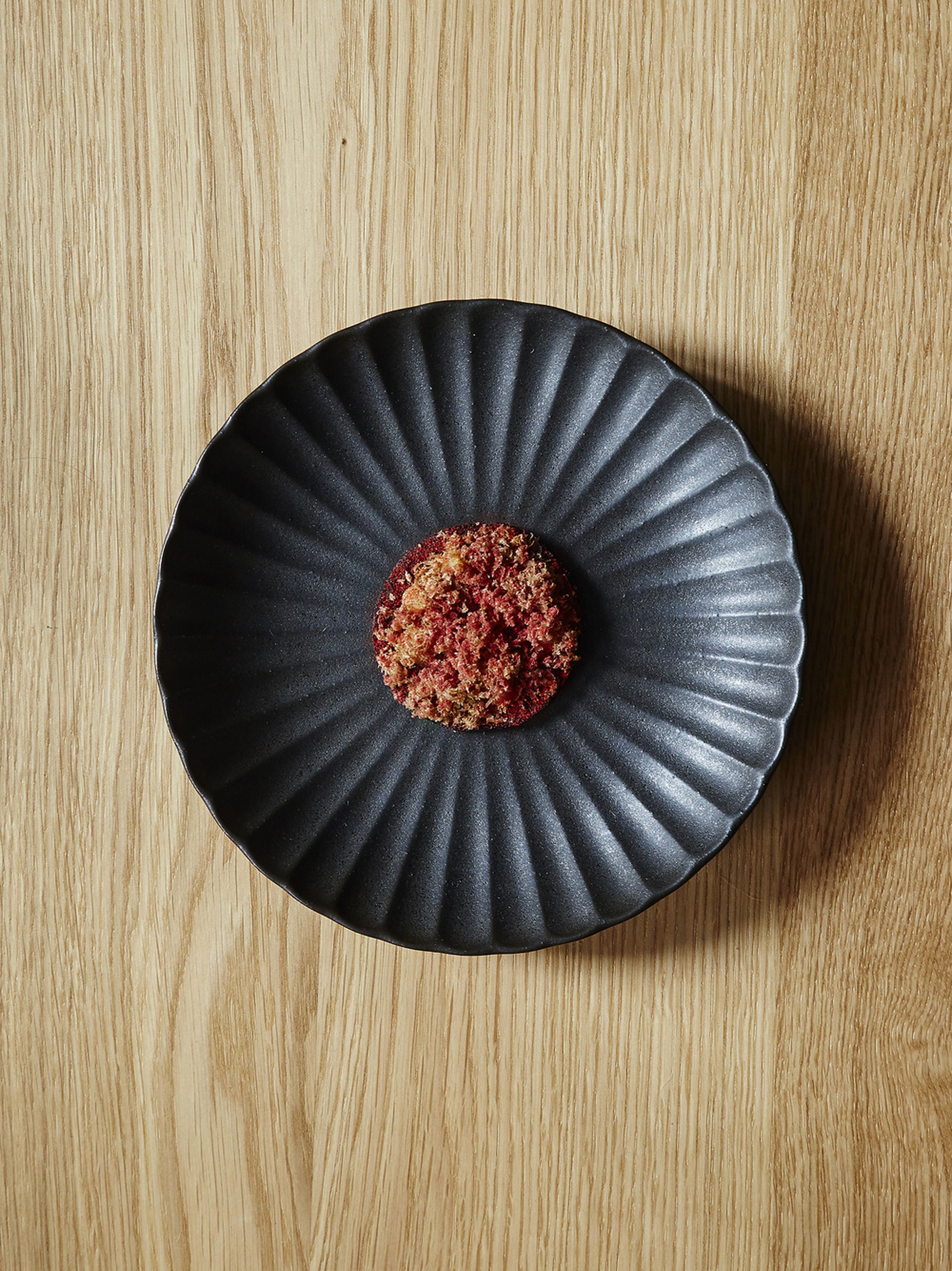
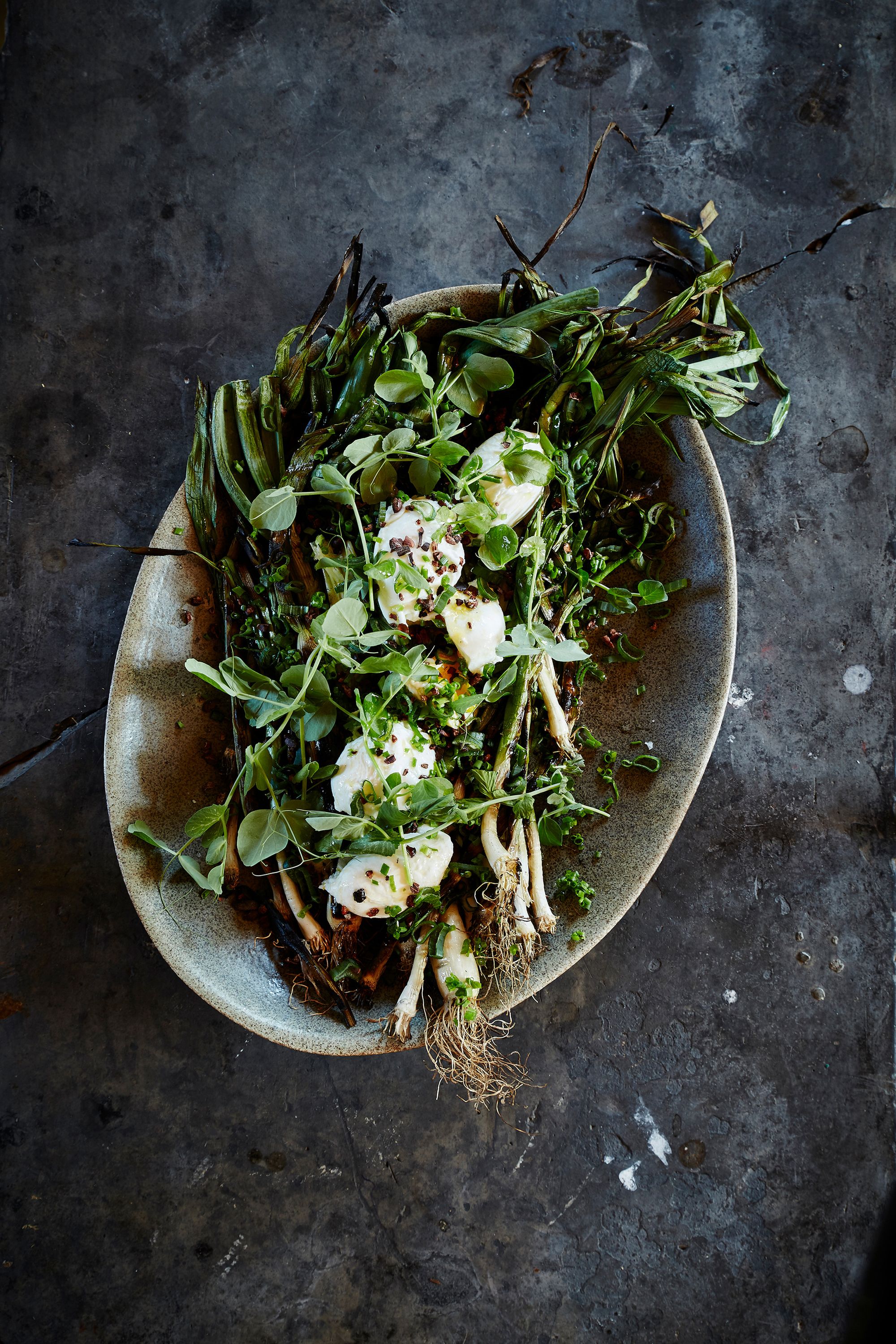
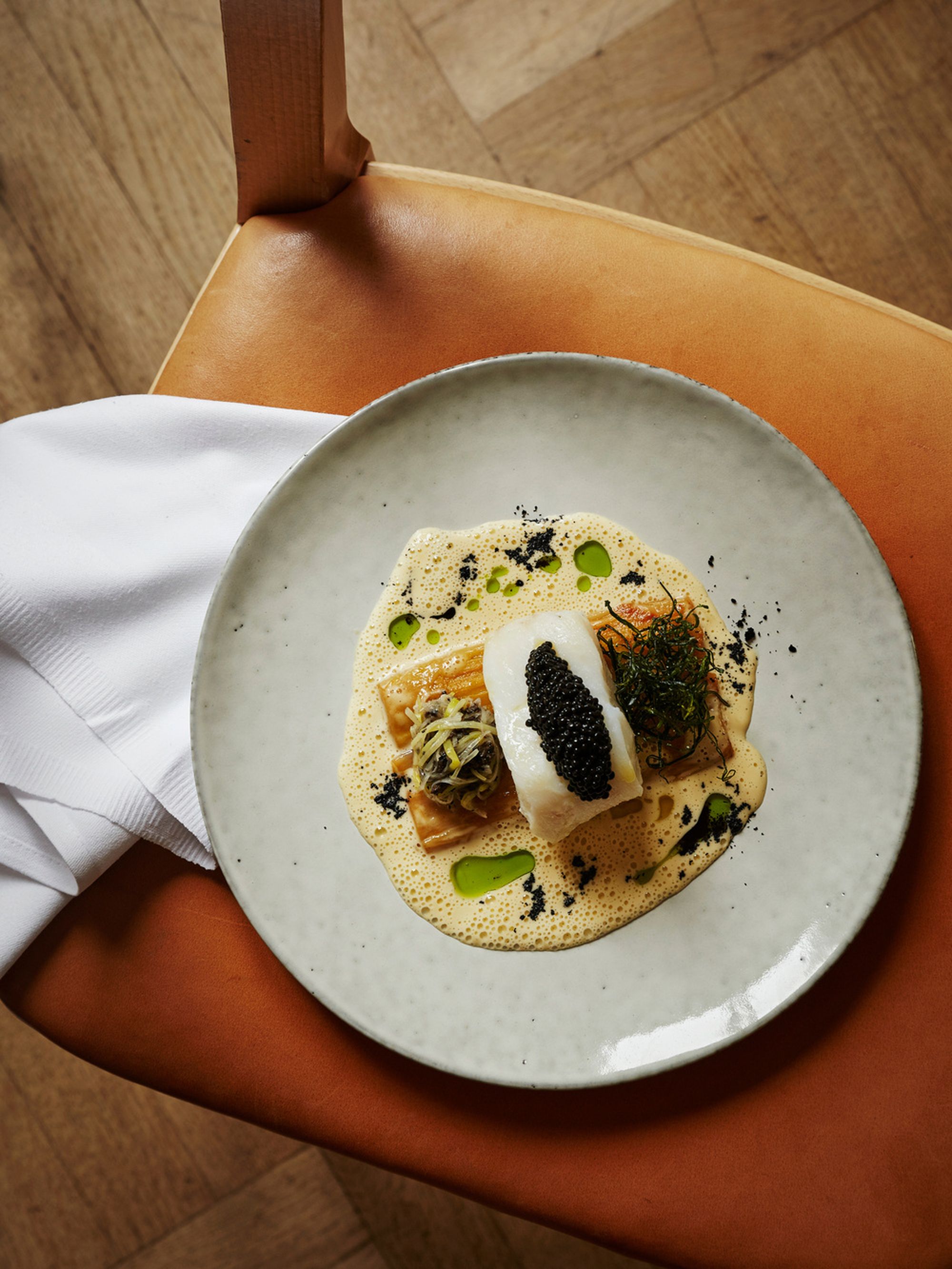
”For this book I wanted to capture textures, colours and light rather than simply present what is put on the plate. In my opinion, interior photography dare to break the rules more often than what we see in food photography, so I tried to move away from the expected image of a plated dish and rather capture a feeling in a true Artilleriet way: We enjoy the beauty of life and do not downplay it. Beauty does not, in practice, mean economic wealth or superficial polish. Artilleriet defines beauty in a raw way that is often looked aside from. Imperfection holds as much soul as perfection does. Not everyone is capable of realizing that. While everything we do is done with the utmost seriousness, it is also with the greatest playfulness. For me as an artist, this is like coming home.” –
Fanny Hansson, photographer.
“Being given 32 different establishments to create a book around, you can either work with the diversity, put emphasis on their differences–or tie them together. Give the stories a calm backdrop and work with balance, through typographic detail and material choices. I chose to go with the latter. I spent so much time on the invisible that I should know how to cook each recipe. (But Idon’t). The linen felt very Artilleriet and the soft creme colored paper turned work so well with Fannys beautiful photos. And the box! I am in love with the box!” –
Maria Kask, graphic designer.